10 Design Rules for Programmers
For some reason, many developers disdain design. We are programmers, we are smart and rational, and we think technically. Designers are weird and artistic, they wear black sweaters and long scarves, they are no match to us. I never quite understood how you can ignore design if you do any front-end job.
Knowing core design principles will help you understand why your designer did what he did, will allow you to spot and fix "design typos", and will also go great lengths to freeing you from pixel-perfect layout slavery. Also, if you ever land in a team without a designer, your product might not make users' eyes bleed.
These rules are fundamental, and not related to web design specifically: use them for documents, presentations, posters — anything you want. Good design does not necessarily mean beautiful; your primary goal is to get information through to someone, and this is exactly where design helps. Just 10 simple rules (OK, to be honest, it's 5 simple rules, 2 difficult rules and 3 tricks to cover-up your mess) — let's go.
1. Layout
Layout does not only refer to CSS, but also to the overall arrangement of things on the page. It should guide your way whether you're working with text, images, controls or color blocks. If you're getting bored reading this, please get bored after this section, as it's crucial.
1.1. Align things
Our brains love order. Even if you live in a messy apartment, loathe military and corporations, and watch Jean-Luc Godard every day, your brain still enjoys order a great deal. The principal way of adding visual order (and thus pleasing the brain) is through alignment. When elements on your page have their boundaries misaligned, the overall design looks messy. When they lie on a common line, it looks sharp and nice.
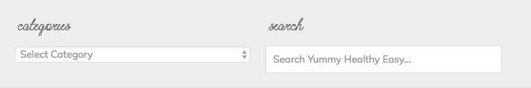
Align left sides:
And also align the baselines:
1.2. Level up: align things visually
Mechanically aligning the CSS boxes is not enough. Depending on the shape of an object, it may appear aligned when sitting to the left or to the right of the real alignment guide. Generally, rectangular things are fine right on that line, round things want to cross it a bit, and pointy things cross it even further. If you want a physical analogy, think of aligning objects' centers of gravity, not the endpoints.
1.3. Don't crush things together
The single best way to make your design look amateurish is putting things too close together. I understand the motivation — you want more information to fit on the screen, or maybe the management just gave you one more menu item and you decided to stick it there since it just fits. The sad truth is, things crushed together look bad.
This is also the hardest point to formulate as a precise rule — I have no idea exacly how much space you should leave between which things. Just don't be afraid to leave some parts of the screen blank. Move things around, ask your friends, and see what works. You'll develop a sense for it over time.
1.4. Level up: move unrelated things even further apart
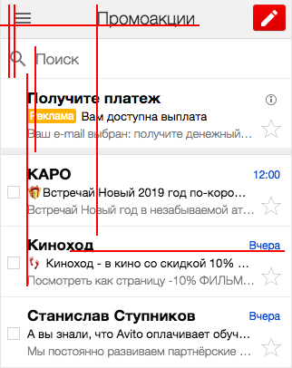
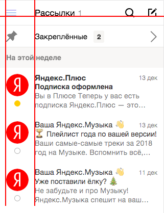
Tne distance between objects in your layout is the visual way of telling people what belongs together, and what is unrelated. The thought experiment to do here is: replace the text with grey rectangles — can you still tell which headers, captions and info blocks (or, simply put, grey rectangles) belong to which other items?
2. Text
Typography might not seem immediately applicable to a typical web application, but text plays a major role in content-based websites. These rules guide mostly the body text — you can skip it for headers, navigation links, form labels and other short items. This also depends on the font and the background, but we'd be going too deep for this post. Maybe next time.
2.1. Opt for legibility over design
Yes, thin, grey and small letters for some reason look more sophisticated. However, when you actually intend the text to be read, go for legibility over design every day. That means:
- Font size that is readable on all screens. The 16px default works well, and never make body text smaller than 14px.
- High contrast. Go for black text on white background. #333 would be the lightest possible, if you want to stretch it. If you decide to invert it (light text, dark background), make sure you have a good reason — "night mode" is about all I can think of.

2.2. Align left
There is one true alignment for the web, and that's left alignment. People read from left to right, and it makes sense to help your readers' eyes find the next line. Right and center alignment definitely don't give you predictable line location.
But what about fitting text to width, you might ask? The books do it that way, and text blocks are nice and rectangular. True, but that requires hyphens — since the quantity of words on a line is not fixed, you have to stretch the spaces either between the words, or between the letters. The text becomes harder to read — the brain doesn't know where to look for the next character. Hyphenation on the web kinda works, but usually puts a hyphen on each line — something you don't see in books. TeX hyphenation is remarkably good, but we're not there yet, and I don't think it's possible in real-time yet. Granted, this sin rarely appears in website design (thsnk god!), but keep it in mind when making documents.
By now, relate the rules together: if you treat the lines as abstract blocks, this corresponds to the "adjust stuff" rule, and gives your design a cleaner appearance.
2.3. Keep line length around 60 characters
With long lines, the readers quickly lose track of where they are on a line. With short lines, you have to move your eyes around too much. Also, left alignment + short lines leaves you with an overtly jarred right edge, because the word length varies. 50 to 70 characters works best.

If you can't quite fit it there, try changing the font size. You can also bypass it for shorter text: 3 lines of 20 chars each is not a big deal.
3. Notes on beauty
If you educate yourself on the above rules and consistently apply them to your designs, you'll end up with bearable but boring pages. We're getting dangerously deep here, but I find these three tips to give you most bang for your buck.
3.1. Use colors the smart way
The first thing people do when trying to make their design more beautiful is painting things into random colors. While some designers can pull it off on some occasions, thinking you can is arrogant. Restrict yourself to shades of grey for text and background and a bright accent color to highlight random things — you might want to use your corporate color here.
You don't even need all the shades of grey (no allusions here) — 7 (including white and black) is more than enough. Add more, and the users' brains would run around trying to prioritize random grey colors that happen to be close by, then settle on the impression that this design is garbage.
If you want more colors, I really like the approach design systems community has taken here with semantic color schemes. Basically, you define a set of action types, and consistently apply colors to them across the interface — think "red for destruction, green for creation" and further fun like "purple for drag-n-drop".
3.2. Every interaction is better with an animation
You don't need to be a motion designer to slap a transition: all 300ms ease into your stylesheet. A sharp transition is harsh and old. An animated transition is smooth and pleasant. These values work particularly well by default — any shorter, and the transition is not noticeable, any longer and the transition becomes annoying.
If you develop for desktop, hover effects work nice. Hover styles by themselves have a reassuring effect on the user — the element is interactive, the mouse is in the right place. With a transition, it's even better.
More generally, any transition that involves elements appearing from nowhere or disappearing look more natural with a transition. I know that means more React work — for one, you have to delay unmounting — but trust me, it's worth it.
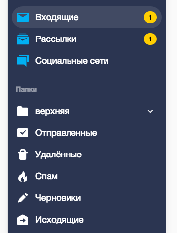
3.3. Everything is better with icons
I'm not quite sure how it works, but text-only designs look, for lack of a better word, poor and amateurish. But drop some icons in there, and they become smart and professional! Maybe it's that icons contain enough detail to distract the brain from layout imperfections.
I hear you objecting that it takes a designer to draw icons. Fear not, creative commons got you covered. I'm sure you already know font awesome and its friend, glyphicons. If you want to go above that, there's a couple fo websites with CC icons: The Noun Project and Icons8. If you need something really special, don't be afraid to draw your own in Inkscape — you can handle circle + line (that's search), a couple of lines (close, menu) or even a triangle (arrows, or, if you add a line, pencil for edit). Don't be shy, unleash your creativity.
One thing to be aware of here is the stylistic integrity of your icon set. This means, mostly: choose filled or outlined icons, sharp or round corners, detail / stroke width, and stick with it. One of the more overlooked consequences here is that you can't just randomly scale icons — the widths would look off. Take care.
Bonus point: mind the context
Good design is always contextual. The principles I described here have their roots in western modernism, that happens to be appealing to educated western people, and, coincidentally, is a safe default for an average webapp / website. They are also pretty generic and neutral. Don't blindly slap these rules everywhere and claim that you've just made it better:
- A website for Chinese audience — from my point of view, you should stuff as much as you can there, and make some of it golden, but there might be some more sophisticated design language underlying these beauties.
- A children's book. Don't assume that children are stupid adults with a knack for bright colors, either.
- The promotional website of a pop star tour — you have to do better than neutral to make people drop their monthly salary on a fiesta,
You haven't just magically become a designer by knowing these principles. Go and apply them to every single thing you make, year after year. You'll find that everything makes more sense now, but you're still not a designer. There's much more to learn. Also: yes, you can find these rules broken right here on this page. Go on and tell me — that counts as practice!